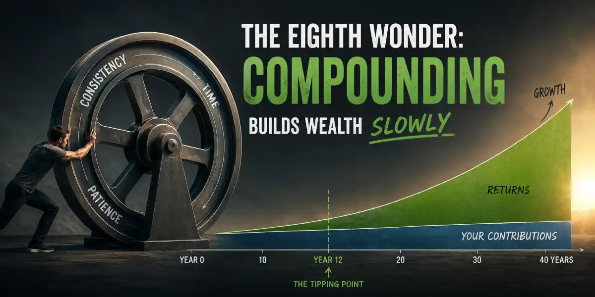
The Eighth Wonder: How Compounding Builds Wealth Slowly
Well, 1st, let’s get the embarrassing part out of the way: the quote in the title, well, its a small fake…
You’ve seen it a hundred times here and there. “Compound interest is the eighth wonder of the world. He who understands it, earns it; he who doesn’t, pays it.” - Albert Einstein. here, users on reddit agrees here, others likes to spent time here, some loved this place more here, then some enjoy this one here too, … actually just take the google search and count it yourself.
It’s on posters, in course intros, at the top of roughly every finance article ever written, but … Einstein almost certainly never said it, or at least nobody found evidence about it. The Quote Investigator went looking and found the “eighth wonder” line floating around anonymously in the 1960s, attached to John D. Rockefeller in a 1981 newspaper column, and only landing on Einstein in 1988, thirty-three years after he died, ehh wiked, no? … and it appears nowhere in his collected papers, it’s simply an ad copy, wearing a genius costume (fits this day’s better).
So, yeah, I’m keeping the title anyway, because the phrase is how most of us first meet the idea, and because the fake attribution is itself the first lesson. Compounding does not need Einstein, it’s simple arithmetic.
It works whether or not a famous person endorsed it, and the reason people reach for a borrowed genius is that the plain version, money makes money, sounds way too ordinary to be remarkable. Yet that ordinary idea has quietly, built more fortunes than any clever investing trick ever has.
It sounds small because, for years, it is small, that’s the whole “problem”. Compounding is almost invisible at first, which is why so many people give up before it has a chance to work. Of course, the more capital you start with, the sooner the effects become noticeable, which helps explain why investors like Warren Buffet saw their wealth accelerate dramatically over time. But the mechanism is the same whether you start with $100 or $100 million, that’s what this article is about.
The gap between knowing and believing
I could recite the compound interest formula long before I could behave like it was true.
I knew it in the way you know a fact from school. Meanwhile, I was doing the thing I wrote about in my first post here: buying META without a thesis, watching the position all day, losing $28K, and telling myself the lesson was about that particular stock, and it wasn’t. The lesson was that I had built my entire relationship with money around events. Here a buy, a spike, a crash, an exit, when the thing that actually builds wealth isn’t an event at all. It’s a process so slow it’s genuinely hard to believe in while it’s happening.
That’s the honest reason compounding gets taught with a magic penny and a fake Einstein quote: the real curve is boring, and boring doesn’t sell. So instead of another metaphor, I wrote a script, ran the numbers I actually care about in EUR (I’m in EUR zone), and then ran the same plan through 38 years of real market history to see how badly the tidy version lies.
Everything below comes out of compounding.py.
Every chart, every number. You can run it, change the assumptions to ones you like better, and get different numbers,
which is the point.
What compounding actually is (it’s about 20 lines of code)
Simple interest: you earn a return on what you put in.
Compound interest: you earn a return on what you put in and on every return you’ve already earned.
That’s the entire difference, and it’s why the curve bends. Each year the thing generating your returns is bigger than it was last year, because last year’s returns joined the team. They show up to work every day without asking for a raise.
Here’s the whole engine, minus the bookkeeping:
def monthly_rate(annual):
    return (1.0 + annual) ** (1.0 / 12.0) - 1.0  # geometric, not annual/12


balance = 0.0
r = monthly_rate(0.07)  # assumed annual return
f = monthly_rate(0.0020)  # annual cost, charged on assets

for month in range(1, 40 * 12 + 1):
    balance += 300  # your contribution
    balance *= (1 + r)  # the market's contribution
    balance -= balance * f  # the industry's cut
Three lines inside the loop; one is you, one is the market, one is the cost, that’s it.
Notice the small thing but an important detail inside monthly_rate: 7% a year is not 7/12 = 0.5833% a month,
because the monthly rate compounds too,
(1.07)^(1/12) - 1 = 0.5654%. Use the naive version and the 40-year answer comes out €43,550 too high, a rounding
detail worth more than a car, which is a fair preview of how this whole subject behaves.
That conversion has a name and a shape worth keeping:
$$ i_{\text{monthly}} = \left (1+r_{\text{annual}}\right)^{1/12}-1 $$
It’s the effective rate conversion, and it runs both ways, because twelve months of compounding must land exactly on the annual figure:
$$ r_{\text{annual}} = \left (1+i_{\text{monthly}}\right)^{12}-1 $$
You’ll meet the same idea again when we talk about APR vs APY. APR
(Annual Percentage Rate) is essentially the naive i × 12 were APY
(Annual Percentage Yield) is the honest (1+i)^{12}-1. It’s also the same mathematics behind
CAGR (Compound Annual Growth Rate), except the exponent counts
years instead of months.
If you’d rather write the loop as one line of algebra, the whole 40year plan is simply the future value of an annuity-due.
First convert the annual assumptions into monthly ones:
$$ \begin{aligned} r_m &= (1+r_a)^{1/12}-1 \ f_m &= (1+f_a)^{1/12}-1 \ i &= (1+r_m)(1-f_m)-1 \end{aligned} $$
where:
r_a= annual returnr_m= equivalent monthly returnf_a= annual fee (0.20%)f_m= equivalent monthly feei= net monthly growth rate after fees
The multiplication matters because the fee is charged on the portfolio after it has grown. The difference is tiny each month, but over decades it adds up.
Then the future value (FV) is
$$ FV=C\cdot\frac{ (1+i)^N-1}{i}\cdot (1+i) $$
where:
FV= future value of the portfolioC= monthly contributionN= number of monthly contributions
At C = 300, N = 480, r_a = 7%, and f_a = 0.20%, the monthly net rate is i = 0.005487, giving
FV = €705,039.80
the same number the loop prints, to the cent. The loop and the algebra are the same object; one simulates the process, the other compresses it into a single equation, boom 🚀.
One convention worth stating, because it changes the answer: the contribution goes in before the return line, so each €300 earns that month’s return immediately. That’s an annuity-due, and it’s the trailing (1+i) in the formula above. If you’d rather model contributions at the end of each month, move balance += 300 below the return and fee lines (or simply drop the trailing (1+i) from the equation). The final value falls by 0.55%, or about €3,847 over 40 years. Not enough to change any conclusion here, but a good reminder that assumptions matter. That’s why I prefer handing you the loop instead of just the answer, you can see every assumption, change it, and watch what happens..
The boring decade, and the year it stops being boring
Here’s the default plan: €300 a month (I’m in EURO zone), 40 years, 7% nominal, 0.20% annual costs, no lump sum, no heroics, no market timing, just consistency.
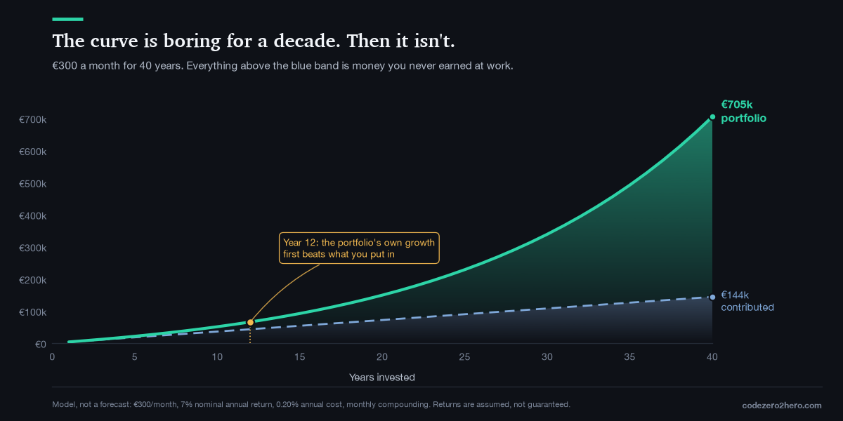
Read the milestones instead of the shape:
| After | Contributed | Value | Growth | Growth as % of balance |
|---|---|---|---|---|
| 10 years | €36,000 | €51,032 | €15,032 | 29% |
| 20 years | €72,000 | €149,434 | €77,434 | 52% |
| 30 years | €108,000 | €339,175 | €231,175 | 68% |
| 40 years | €144,000 | €705,040 | €561,040 | 80% |
Ten years in, a decade of never missing a month, of not panicking, of not being clever and you’re up €15,032.
That is a real number and a real achievement, and it is also nowhere near what the word “exponential” made you expect. Ten years of discipline bought you about four years of contributions’ worth of growth. This is the stretch where people quit, not because the math failed, but because the math is quiet and a friend just made 40% on something in three weeks.
Now find year 12 on the chart, that’s the crossover: the first year the portfolio’s own growth beats what I put in.
- Year 11: I contributed €3,600. The portfolio earned €3,594. It lost, by six euros.
- Year 12: I contributed €3,600. The portfolio earned €4,082.
- Year 20: I contributed €3,600. The portfolio earned €9,391.
- Year 40: I contributed €3,600. The portfolio earned €44,700, more than a year’s salary for a lot of people, on the same €300 a month.
Nothing changed in year 12. No new strategy, no better stock. The balance simply got large enough that a 7% return on it outweighed my paycheck’s contribution. From that year on, the portfolio is doing more of the work than I am, and the gap widens every single year after.
That’s what compounding “taking over” means, concretely. It’s not a feeling, it’s a specific year on a specific chart, and for a €300/month plan at these assumptions it’s year twelve. If you want one number from this post, take that one, because it reframes the first decade. The first decade isn’t the payoff; the first decade is you building the thing that will pay off. It’s supposed to look unimpressive.
And a warning that goes with it: 80% of that final balance is growth, which means 80% of it depends on years 25 through 40 actually happening. The last decade of a compounding plan produces more absolute euros than the first three combined. Which brings us to the most uncomfortable chart in the set.
Ana and Bogdan
Two people (used a lot of imaginations to get this names), same 7%, same €300 a month, but with a small detail:
Ana starts at 25, she invests for ten years, until she’s 35 and then stops completely. Total contributed: €36,000, she never adds another euro, she just doesn’t sell.
Bogdan starts at 35, serious guy (clearly), he invests €300 every month without fail until he’s 65. Thirty years, no gaps. Total contributed: €108,000, three times Ana’s.
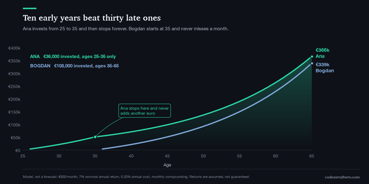
At 65: Ana has €365,865 and Bogdan has €339,175. Ana wins with a third of the money, because her euros got ten extra years on the clock and each of those early years is an extra multiplication applied to everything that follows, wiked no? Bet you didn’t expected that!
I want to be careful with this one, because it’s the chart that gets used to make people in their thirties feel doomed, and that’s both cruel and wrong, so two honest caveats:
-
Ana’s advantage is time, not virtue. If you’re 38 and just starting, you can’t buy back your twenties, but you also aren’t in Ana’s exact position, she stopped. Nothing forces you to. Run the script with
contribution_growth=0.03(you raise your monthly amount 3% a year as your income grows, which is what actually happens to most people) and the 40-year plan lands at €1,040,756 on €271,445 contributed. Time is a powerful lever, but it isn’t the only one. As careers progress, many people are able to invest more each month, and increasing your savings rate is one of the biggest levers you still control. -
Nobody actually stops investing at 35 and then disappears for the next thirty years. Ana’s scenario is a teaching device, not a life plan. The real version of Ana’s advantage is: start now, and stop treating “I’ll begin when I earn more” as a neutral decision. It isn’t neutral, it’s the single most expensive decision in this entire article, and it costs the most when you’re youngest and it feels least urgent. I wish someone had explained that to me in my twenties.
The two thieves
The model above assumes 0.20% in costs and zero inflation. Both assumptions are generous and here’s what happens when you make them realistic.
Thief one: costs
Same contributions, same 7% market return. The only thing I changed is the annual fee.
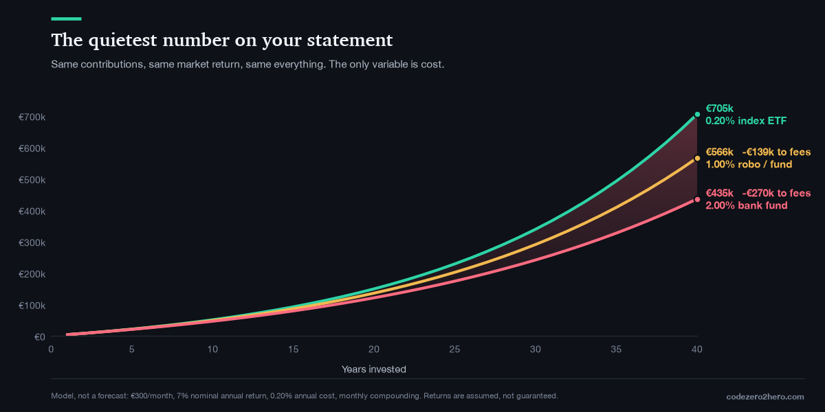
- 0.20%/yr (a cheap UCITS world index ETF): €705,040
- 1.00%/yr (a fund-of-funds, a managed portfolio, a robo with a platform fee): €566,273, €138,767 gone
- 2.00%/yr (a classic actively managed bank fund, which is what a lot of people in Romania are actually sold): €435,435, €269,605 gone, 38% of the outcome
Read that again, because the framing on your statement will never present it this way. A 2% fee does not cost you 2%, reality it costs you 38% of your final balance, because every euro of fee is a euro that never got to compound for the remaining decades. The fee compounds too, just for someone else.
This is the least glamorous and highest-certainty decision in investing. You cannot control what the market returns. You can read a KID document (Key Information Document) and know your total cost to two decimal places before you buy anything. One of those is a guess; the other is a fact you’re allowed to check.
Thief two: inflation
Here’s the one I have to look at as a Romanian investor, and it’s genuinely unpleasant. The €705,040 above is a nominal number: the digits on a screen in 2066 and what matters is what those digits buy.
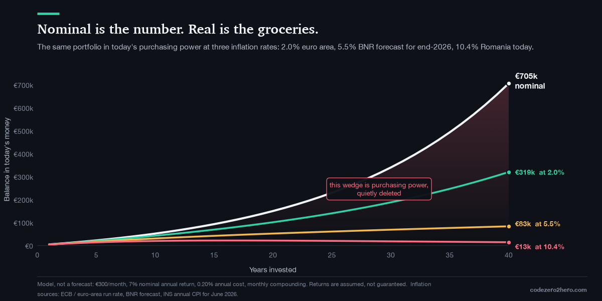
- Nominal after 40 years: €705,040
- In today’s money at 2% inflation (roughly the euro-area target): €319,306
- In today’s money at 5.5% (BNR’s revised forecast for end-2026): €82,816
- In today’s money at 10.4% (Romania’s actual annual CPI in June 2026 (real one is higher), per INS, the highest rate in the EU, against 2.8% in the euro area): €13,473
That last line is not a prediction. Nobody sane forecasts 10.4% inflation for forty consecutive years, and BNR expects it around 2.9% by the end of 2027. I include it because it shows the mechanism at full volume: inflation is compounding running in reverse against you, using the same exponent, and it never takes a year off. The gap between the €319k line and the €82k line is the difference between two inflation rates that both sound like small percentages.
This is the sequel to Inflation: The Silent Thief, and it’s the answer to the question that post left open. If cash is guaranteed to lose to inflation, and inflation compounds, then the only defense that scales is an asset whose returns also compound and that has to run for decades to win, because it’s a race between two exponentials. Cash doesn’t lose the race slowly, it loses it exponentially.
The third one nobody mentions: tax friction
Not quite a thief (maybe a more lucrative thief) it’s the price of living in a country, and it has the same shape, so it belongs here.
From 1 January 2026, Romania’s tax rules changed (Law 239/2025). If you trade through an intermediary that is resident in Romania or has a permanent establishment in Romania, realised gains are taxed at source at 3% for securities held 365 days or more and 6% for those held less than 365 days, up from 1% and 3%. If your broker has no Romanian permanent establishment (for example, Interactive Brokers, Trading 212, or eToro), you generally declare the gains yourself, and the tax is 16% on your annual net capital gain. The tax on dividends also increased from 10% to 16% from 1 January 2026.
I’m not a tax advisor, and you should verify your own situation against official guidance and your broker documentation before doing anything, rules are always changing. But the compounding implication is worth stating plainly, because it’s structural rather than situational: tax paid is capital that stops compounding. Every realised gain hands over a slice of the base that would otherwise have kept multiplying for the remaining decades. This is a large part of why accumulating UCITS ETFs are so common in EU portfolios, dividends are reinvested inside the fund and you don’t realise a gain until you sell and it’s a real, boring, jurisdiction-specific reason why frequent trading is expensive in a way that has nothing to do with being right or wrong about the stock.
Cost, inflation, tax. Three drags, all exponential, all more controllable than the market return everyone obsesses over.
Now the honest part: the smooth curve is a lie
Every chart so far assumes 7% every single year, like a savings account. Markets do not do that. So I ran the identical plan through what actually happened: €300 a month into the S&P 500 total return index (dividends reinvested, which is the whole point) every month from January 1988 to July 2026, same 0.20% costs.
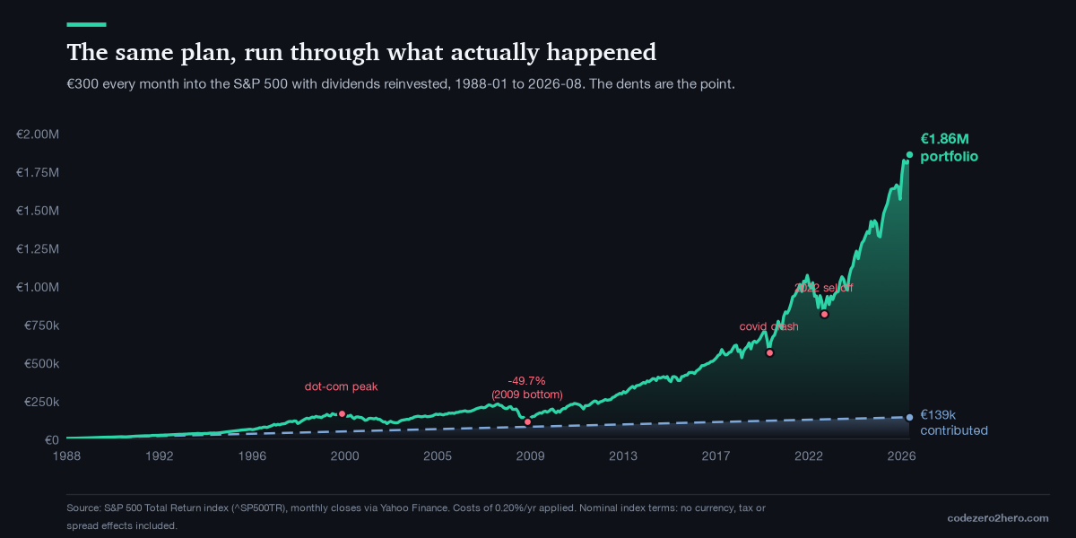
The headline is spectacular, 12.96× the money contributed. Ignore it for a second and look at the dents, because the dents are the actual lesson:
| Date | Contributed | Value | Multiple |
|---|---|---|---|
| Aug 2000 | €45,600 | €166,367 | 3.65× |
| Feb 2003 | €54,600 | €102,266 | 1.87× |
| Oct 2007 | €71,400 | €225,515 | 3.16× |
| Feb 2009 | €76,200 | €113,467 | 1.49× |
| Mar 2020 | €116,100 | €560,817 | 4.83× |
| Jul 2026 | €138,900 | €1,800,187 | 12.96× |
The worst drawdown for this plan was −49.7%, bottoming in February 2009, sit with that row. Twenty-one years of never missing a monthly payment, and the portfolio was worth €113,467 against €76,200 contributed. Two decades of discipline had bought a 1.49× multiple. Between October 2007 and February 2009 the balance fell by €112,048 while still adding €300 every month, which is more than the plan had contributed in its previous fifteen years combined.
Anyone who tells you compounding is comfortable is selling something. The €1.8M at the end and the −49.7% in the middle are the same investment. You do not get one without agreeing to the other, and the chart only reaches €1.8M for people who kept buying in February 2009 when every input, every headline, and every instinct said stop.
And one more inconvenient truth: your result depends heavily on when you happened to be born. Same plan, same 20 years, every possible starting month in the data:
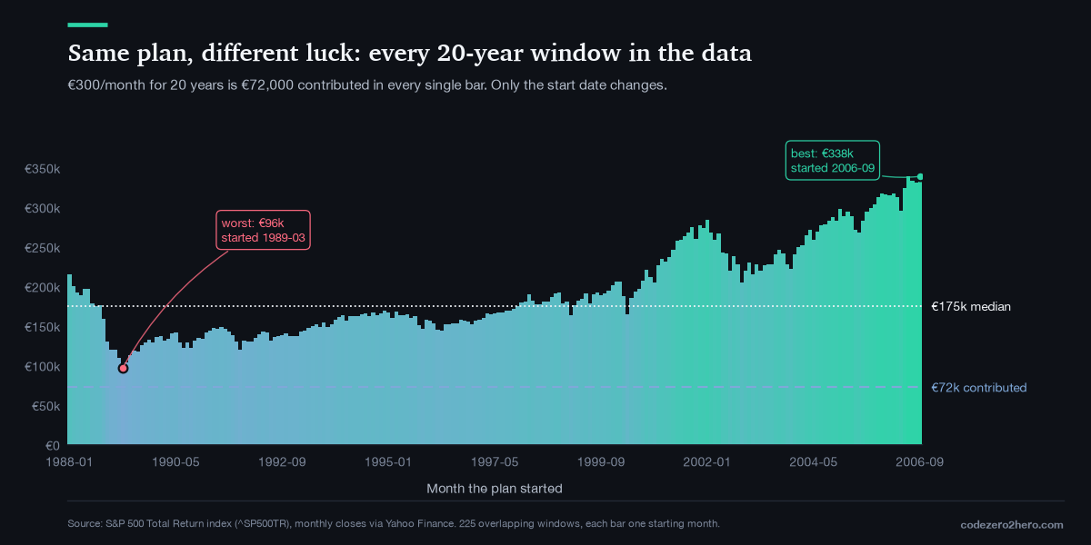
Identical behaviour, identical discipline, identical €72,000 and a 3.5× spread in outcomes based on nothing but the start date. The worst windows started in 1989 and ended in the 2009 crater; the best started in 2006, bought straight into the financial crisis, and rode everything after.
Sequence of returns is real, it is luck, and no amount of discipline eliminates it. What discipline does is keep you in the game long enough that the range narrows, note that even the worst 20-year window still finished ahead of the €72,000 contributed, and comfortably ahead of what cash would have done against inflation.
Three caveats on this data, since I’d rather flag them than have you find them:
- It’s the US market, in index terms, over a historically excellent 38-year stretch. Japan’s equivalent chart from 1989 looks nothing like this. I chose it because it’s the longest clean total-return series I can pull for free, not because it’s the future.
- No currency effects. A euro investor buying a USD-denominated index carries EUR/USD risk that this chart ignores entirely. That’s a whole separate article (it’s in the roadmap).
- No tax, no dividend withholding, no bid-ask spread. Real returns land below this line.
- No portfolio management. The model assumes a passive buy-and-hold strategy. It doesn’t account for rebalancing, changing investments, or other portfolio decisions, all of which can materially change outcomes.
Where the model lies to you (all of it, in one place)
Because a script that only produces impressive numbers is a sales tool, not an analysis:
- The 7% is invented. It’s a plausible long-run nominal figure for global equities, not a promise. Run the script at 5% and 40 years gives €423,912. Run it at 9% and it gives €1,201,497. A ±2 point change in an assumption I cannot verify swings the answer by nearly 3×. Every compounding projection you’ve ever seen, including mine, is that fragile. Treat the shape as the message and the number as an illustration.
- Constant contributions are unrealistic. Real life has job losses, kids, moves, a broken car in month 74.
- Constant returns don’t exist, as the two real-data charts above just demonstrated.
- Forty years is a long time. It assumes you don’t need the money, don’t panic, don’t get a divorce, don’t have your country’s tax regime rewritten around you and the tax section above shows how fast that last one can move.
- It ignores currency, withholding tax, and spreads.
- Reality is messier than any spreadsheet. Markets change, governments change, your life changes. The model is useful because it isolates the mechanics of compounding, not because it predicts the future.
None of that breaks the argument. It just means the honest claim is narrower than the poster version: given a plausible return, a long enough horizon, low costs, and behaviour that doesn’t interrupt the process, most of your final balance will be growth rather than savings and the growth arrives disproportionately at the end.
That’s less catchy than Einstein but at least, it’s true.
He who doesn’t understand it, pays it
The fake quote has one line that’s worth keeping, because compounding does not care which direction it runs.
A €3,000 balance carried on a credit card at 25% for three years becomes €5,859. Not €5,250, which is what “25% × 3 years” feels like €5,859, because the interest compounds against you exactly the way your portfolio compounds for you. Consumer credit is the same eighth wonder, pointed the other way, and it runs at rates no equity portfolio has ever sustained.
I don’t have a clever framework for this. Just an ordering: pay off compounding debt before starting a compounding portfolio, because nothing in the equity market reliably beats 25%.
My current rule
Written down so future-me can be held to it, and revised when I learn more:
- Automate the monthly contribution. Not “invest what’s left.” A standing order, on payday, that I don’t renegotiate with myself every month. My decision-making is the least reliable component in this system; the fewer decisions, the better.
- Know my all-in cost to two decimals before I buy anything, and treat anything above ~0.5% a year as needing an explicit justification I can write in a sentence.
- Measure in real terms. A €705,040 line means nothing on its own, I care about the number after inflation, and living in a + 10.4% CPI country makes that non-optional.
- Judge the first decade by consistency, not by balance. The balance in year 8 is not evidence of anything, whether I missed a month is.
- Assume a −50% drawdown will happen at least once. It’s in the data above, deciding now, what I’ll do then is worth more than any return assumption.
- Don’t interrupt it. The 80%-is-growth figure only exists if the last decade actually happens. Selling out in year 15 to catch something exciting isn’t a small deviation, actually it deletes the part of the curve that does all the work.
Your action step
Don’t take my assumptions, take the script and work it out as you please.
# grab it from https://github.com/codezero2hero/scripts
pip install matplotlib
python3 compounding.py

# and with real market history (needs yfinance):
pip install yfinance pandas
python3 compounding.py --real --dark --out charts_dark
Then change three lines at the top MONTHLY to what you can genuinely commit to, RETURN to a number you’re willing to
defend out loud, YEARS to your actual horizon and re-run it. It writes compounding_base.csv alongside the charts, so
you can open the year-by-year table in a spreadsheet and check my arithmetic instead of trusting it.
Then find your crossover year. The year your portfolio starts out-earning your contributions. Write that year on something you’ll see again. Everything before it is you building the machine, and knowing that in advance is the difference between a boring decade and a failed one.
Have fun and ‘njoy the ride!
Read next
Prerequisite: Inflation: The Silent Thief and Why Cash Is Risky why the real-terms chart above is the only one that counts.
Related concept: The Dip I Kept Waiting For: Why Time in the Market Beats Timing It the behavioural half of this post.
Foundation: What Is a Stock what the thing doing the compounding actually is. Next lesson: Why Stock Price Alone Means Nothing, price vs. market cap vs. enterprise value.
Tool: How I Use SEC EDGAR to Compare Companies (Part 2) pulling the numbers yourself, from the filings.
Companion code: compounding.py runs every scenario and chart in this
post, writes a year-by-year CSV so you can check the arithmetic, and with --real downloads actual S&P 500 total-return
history and runs the same plan through it.
This is an investing journal, not financial advice. I’m learning in public and possible I get things wrong. Verify anything here before it costs you money that’s the whole method.
Comments
0