One morning this April, one of the most expensive stocks in America suddenly cost about two hundred dollars.
Booking Holdings, the company behind Booking.com, the site half of Romania uses to book seaside apartments in Greece, had spent years trading at a share price that looked like a typo. North of four thousand dollars for a single share, roughly a used Dacia per slice. Then, in April 2026, the company executed a 25-for-1 stock split, and each of those four-figure shares became twenty-five smaller ones. As I write this, a share of Booking trades at $ 207.39.
So here’s the question that this entire post hangs on: did Booking Holdings get 25 times cheaper?
If any part of your brain whispered well, kind of… it’s more affordable now, this post is for you. Because the honest answer is: nothing happened. Not one thing about the business changed. Same hotels, same commissions, same profits, same everything. To use an analogy, the pizza got cut into more slices an nobody got more pizza.
I’m allowed to be smug about this for exactly zero paragraphs, because past me failed this quiz completely. In my playing-the-market days the era that cost me $28K of tuition, story in the first post of this series, my watchlist was sorted by share price. I remember genuinely feeling that Ford at eleven dollars was “cheap” and that anything over a thousand dollars was “expensive”, the way a €2 espresso is cheap and a €9 one is a scam. I wasn’t comparing businesses, I was comparing ticket prices to different concerts and concluding the cheaper ticket was the better band.
A share price, on its own, tells you almost nothing. Not how big the company is. Not whether it’s cheap. Not whether it’s doing well. To actually say anything, you have to climb a short ladder, three numbers, each one more honest than the last:
Share price → what one slice costs.
Market cap → what all the slices cost together: the sticker price of the whole company.
Enterprise value → the all-in price: what the whole company would really cost you once its debts and its cash are counted.
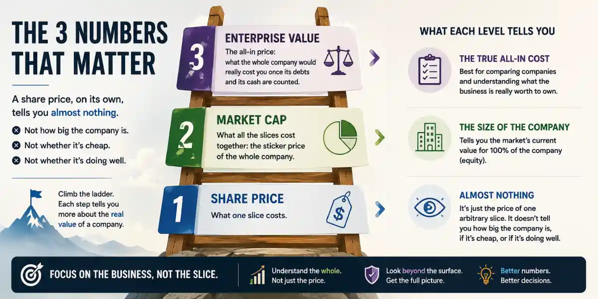
The last post in this series ended with price is not value. This one is about something that trips people up even earlier: price is not even price. The number in your app isn’t the price of the company, it’s the price of one arbitrary slice of it so let’s climb the ladder, shall we?
The pizza problem
A company can cut itself into as many shares as it likes (stock split). That decision is close to meaningless economically, and it completely determines the share price.
Take the same €40 pizza, cut it into 8 slices, each slice “costs” €5. Cut it into 16, each slice costs €2.50. Has the pizza gotten cheaper? Is anyone fuller? The number of slices is a formatting choice, so is a company’s share count.
The proof is what a stock split does. In June 2024, Nvidia ran a 10-for-1 split: a roughly $1,200 share became ten $120 shares overnight. Every owner had ten times the shares and the exact same ownership. This April, Booking did the same thing 25-for-1. In both cases the headlines said things like “now more affordable for retail investors,” and in both cases the affordability was an optical illusion. You could already buy a fraction of either company for €50 through many of the brokers European retail investors actually use fractional shares have made the “affordability” argument mostly theater. The company didn’t get cheaper, only the denominators changed.
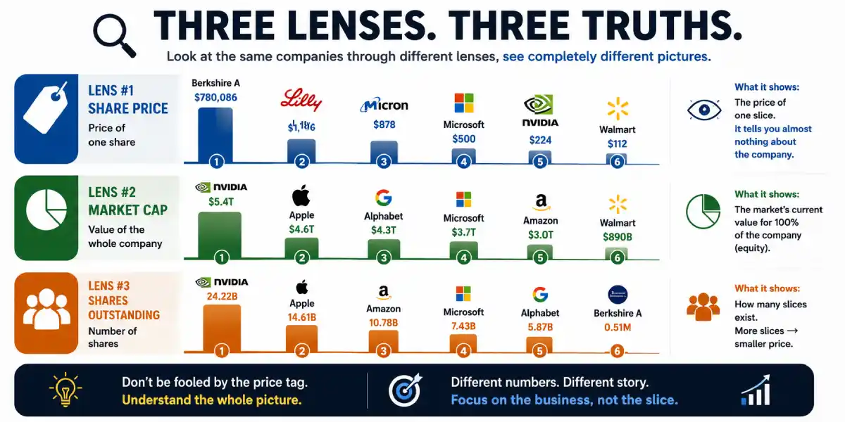
And the reverse experiment also exists, permanently, in one glorious extreme: Berkshire Hathaway’s Class A shares have never split. As of today a single share costs a whopping $781,593, more than most apartments in Bucharest. Is Berkshire therefore the most “expensive” stock in the world? By slice price, wildly so, purely because Warren Buffett never cut the pizza. And yet, as we’re about to see, the company is smaller than several businesses whose shares cost less than a pizza.
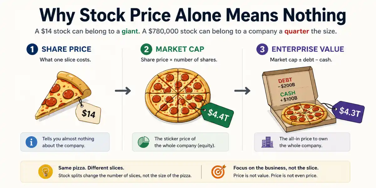
Share price is the size of one slice. It carries no information about the size of the pizza, none. A $14 stock can belong to a giant and $780,000 stock can belong to a company a quarter the size of a $222 one. Until you know how many slices exist, the price of a slice is trivia.
Remember: A stock split changes the number of slices. It changes nothing else.
If splits change nothing, why do companies do them?
Mostly psychology, partly plumbing. A $200 share feels approachable in a way a $5,000 share doesn’t, fractional shares or not, and companies know that feeling moves retail money. A lower price can smooth trading in smaller lots, and it makes stock compensation tidier (granting an employee “0.03 shares” is awkward). Options contracts cover 100 shares apiece, so a lower share price makes that market accessible to more participants. And one genuinely structural quirk: a few old stock indexes weight companies by share price, so an unsplit four-figure stock distorts or disqualifies itself. All real reasons, none of them creates a cent of value, in the end a split is packaging.
Which company is bigger?
The moment you make this one multiplication, the world reorders itself. Literally. I pulled six well-known companies, ranked them by share price, then ranked them by market cap, prices from August 7, 2026, share counts from each company’s own SEC filings:
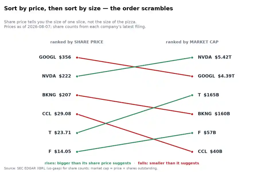
Six companies ranked by share price on the left and market cap on the right, the ranking scrambles almost completely, look at what the lines do.
Price tag #2: the sticker on the whole company
The first honest number is one multiplication away.
$$\text{Market capitalization} = \text{Share price} \times \text{Number of shares}$$
That’s it, if the market prices one slice at $14.05 and there are about 4 billion slices, the whole pizza is being priced around $57 billion. Market cap is what the stock market, right now, thinks all the equity of the company is worth, the sticker price on the whole thing, not on one slice.
Alphabet has the most expensive share of the six at $356, and it is not the biggest company. Nvidia, at $222 a share, is. A share of Nvidia costs less than a share of Alphabet, and the company is a trillion dollars bigger. Meanwhile, Carnival, the cruise company, has a higher share price than AT&T around $29.08 versus $23.71, while AT&T the company is four times the size of Carnival the company. Ford at $14.05, the “cheap” stock of my old watchlist, is a bigger company than Carnival at twice the slice price.
And the pair that breaks the illusion for good: at $356 a share, Alphabet’s shares cost roughly 2,200 times less than Berkshire’s Class A at $781,593, while Alphabet the company, at about $4.4 trillion, is nearly four times bigger than Berkshire at about $1.1 trillion. Rank by price and Berkshire crushes everything, rank by size, and it’s not close, in the other direction.
Sorting by share price isn’t a rough approximation of sorting by size, it’s noise. The two orderings have nothing to do with each other, because the share count sitting between them is an arbitrary historical accident, how many times the company split, how much stock it issued or bought back, decisions made across decades for all sorts of reasons.
So when a headline says “Nvidia is worth $5 trillion,” that’s market cap: price × slices. When your app says “NVDA $ 222.37,” that’s one slice. The two numbers live on different floors of the ladder, and mixing them up is how people end up believing a $5 stock is “cheaper” than a $200 one. Sometimes, it might be, but the share price has no opinion on the matter.
One more thing market cap quietly teaches: the market prices companies continuously, as whole businesses. When Nvidia’s market cap slips from, say, $5.42 trillion to $5.30 trillion in a day, the auction just repriced the entire company down by $120 billion, roughly three whole Carnivals, usually on nothing more than mood or fear. Seeing moves in market-cap terms instead of price terms is a useful habit: “the stock fell $ 5” sounds like nothing; “the market just decided this business is worth three fewer Carnivals than yesterday” makes you ask based on what?, which is exactly the right question, and one we’ll keep asking in the valuation posts.
But market cap is still only the sticker on the equity. There’s one more rung, and it’s where things get properly interesting.
Price tag #3: what buying the whole thing would actually cost
Here’s a thought experiment that rewired how I look at companies. Forget shares for a second, imagine buying the entire business, the way you’d buy an apartment.
When you buy an apartment, the listing price is for the apartment free and clear. If the seller still owes the bank €200,000, that’s the seller’s problem; their mortgage gets paid off at closing out of the money you hand over. You pay one price, you get the keys, no debts attached, houses trade clean, boom.
Companies don’t trade clean. When you buy a company, its debts come with it.
Market cap only buys you all the shares, the equity. But the company you now own still owes every euro/dollar of its debt. Its bonds don’t evaporate because the shares changed hands; the obligations sit inside the thing you bought, and they’re now your problem, exactly as if the apartment came with the seller’s mortgage still bolted to it. On the other hand, the company’s bank account also comes with it, whatever cash is sitting in the till on closing day is yours, and you could use it to pay down those inherited debts the moment you get the keys.
So the true keys-in-hand price of a business, enterprise value, explained by that one apartment listing, is:
Enterprise value = market cap + debt − cash.
You pay the sticker, you inherit the debts, you pocket the till. Concretely, take the most dramatic case on my chart: Carnival, still working down its mountain of pandemic-era borrowing.
| Carnival (CCL) | as of Aug 7, 2026 |
|---|---|
| Market cap (the sticker) | $40B |
| + debt you inherit | $25B |
| − cash in the till | $2B |
| Enterprise value (the all-in price) | $63B |
The all-in price is 56% higher than the sticker, every “cheap” dollar of Carnival equity drags $0.56 of old borrowing behind it. AT&T is more extreme still: a $165 billion sticker on a business that costs $291 billion once you count the $144 billion it owes. Neither number is hidden; both sit on the first page of the balance sheet, one 10-Q away. (Reading that page is a skill of its own, Balance Sheet Without a Finance Degree is coming in a later blog article).
Now run the ladder on all five companies I charted, and watch how differently the same exercise can end:
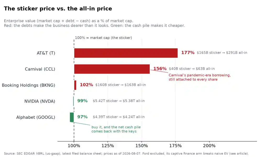
Enterprise value as a percentage of market cap for five companies. AT&T and Carnival far above 100%, Booking just above, Nvidia and Alphabet below.
Three completely different species are hiding inside “similar” stickers:
The debt-heavy (AT&T at 177%, Carnival at 156%): the business costs far more than the sticker. Not automatically bad, don’t get it wrong, AT&T’s debt finances a network that throws off steady cash, but compare its sticker to another company’s sticker without noticing the extra $126 billion of net obligations, and you’re comparing a clean apartment to one with two mortgages.
The boring middle (Booking at 102%): $20.2B of debt, $17.2B of cash, nearly a wash. Plenty of companies live here, where the distinction rarely changes a decision.
The cash-rich (Nvidia at 99%, Alphabet at 97%): the all-in price is below the sticker. Alphabet holds $242 billion of cash and liquid investments against $100 billion of debt, buy the company and about $142 billion comes right back to you, a discount at the register.
Two companies with identical market caps can cost wildly different amounts as businesses. Each rung strips one illusion: the share price told you the slice, market cap told you the equity, EV tells you the business. (An honest asterisk: nobody actually gets to buy a company at market cap, acquirers usually pay premiums, lawyers appear. EV is the accounting skeleton of the takeover idea, and the skeleton is the useful part: it lets you put differently-indebted businesses side by side. Why analysts price indebted companies on EV-based multiples instead of P/E, Why EV/EBITDA Exists, is a later lesson on the future articles I will write.)
Remember: Share price tells you almost nothing. Market cap tells you the company’s size. Enterprise value tells you what buying the business would actually cost.
Pull the numbers yourself
Everything above comes from two sources, and only two: live market prices, and the companies’ own SEC filings. In the
spirit of this series, the companion script price_cap_ev.py,rebuilds the whole ladder from scratch,
and I’d genuinely rather you run it than trust my screenshots.
One design decision in it is the lesson of this post. Share counts, debt, and cash come from SEC EDGAR’s free XBRL API, the same numbers the CEO signed, and they refresh four times a year. The price is fetched live from Yahoo Finance every single time you run the script:
def get_prices(tickers):
    import yfinance as yf  # pip install yfinance
    return {t: float(yf.Ticker(t).history(period="1d")["Close"].iloc[-1])
            for t in tickers}  # (the real script adds a stale-snapshot fallback)
Why fetch one ingredient live and read the rest from quarterly filings? Because that’s their honest shelf life. Filings describe the business, slowly, quarterly, audited. Price is a live auction, twitchy, unaudited, stale the moment you look away. Run the script on Monday and again on Thursday: every share count, debt figure, and cash balance will be identical, and every price will have moved. That asymmetry, fast noisy price on top of slow knowable facts, is the entire structure of the stock market, and the script wears it: one column refreshes every run, the rest refresh four times a year. (If Yahoo hiccups, or you’re offline, it falls back to a snapshot of prices from the day I wrote this peace of code, which are, of course, already wrong. Even the fallback makes the point).
Running it prints the full ladder and the provenance of every number:
NVDA     $222  × 24.39B shares =  $5.42T  |  +  8.5B debt −  50.3B cash =  $5.38T EV  ( 99%)
GOOGL    $356  × 12.31B shares =  $4.39T  |  + 100.2B debt − 242.5B cash =  $4.24T EV  ( 97%)
T      $23.71  ×  6.95B shares =   $165B  |  + 144.0B debt −  17.6B cash =   $291B EV  (177%)
BKNG     $207  ×  0.77B shares =   $160B  |  +  20.2B debt −  17.2B cash =   $163B EV  (102%)
F      $14.05  ×  4.07B shares =    $57B  |     EV skipped — captive finance arm (see below)
CCL    $29.08  ×  1.39B shares =    $40B  |  +  24.9B debt −   2.2B cash =    $63B EV  (156%)
As always with primary sources, the fetching is where reality bites, and I’ve left the bite marks in the code on
purpose. Companies tag the same concept under different XBRL names, so the script tries candidates in order and the
candidates are a small museum of corporate quirks. Nvidia quietly moved its short-term investments to a new tag
(DebtSecuritiesCurrent) in its 2026 filings, so a script written against last year’s tag silently loses $37 billion of
Nvidia’s cash pile. AT&T doesn’t file plain LongTermDebtNoncurrent anymore; its long-term debt lives inside a tag that
folds finance leases in. And Ford, well Ford’s per-concept API endpoint returns an empty shell for a share count that
plainly exists in its filings, so the script falls back to downloading the company’s entire facts file and digging the
number out of that. None of this is in any tutorial, all of it is in the code, commented so you can use it. The
primary source is free; it just isn’t frictionless, the friction is where you learn.
The script also writes a CSV with every figure and the exact XBRL tag it came from, so you can put the numbers next to the actual 10-Q and check. Verify, don’t trust, including me.
Why beginners get this wrong (I was this beginner)
The “cheap stock” reflex. A low number, feels affordable because that’s how every other price in life works, espresso logic. But a share price is a ratio (equity ÷ slice count) with an arbitrary denominator, and supermarket instincts don’t apply to it.
“I can buy more shares of the cheap one.” 350 shares of a $14 stock and 22 shares of a $222 stock are both about $ 5,000 of ownership. What compounds is the percentage move, and percentages don’t care how many pieces your money is cut into.
Split hype. Companies know retail investors feel the espresso logic, that’s exactly why splits get announced with fanfare. If a split makes a stock feel buyable where it didn’t before, that feeling is the illusion this post exists to kill.
Mixing up the floors of the ladder. “Nvidia hit $5 trillion” (market cap) and “Nvidia hit $222” (slice price) read as the same kind of fact. They aren’t, and until the translation price × shares outstanding becomes a reflex, headlines will keep smuggling the wrong intuition into your head.
Comparing stickers while ignoring mortgages. The subtle one, and professionals do it too. The world’s favorite shortcut, the P/E ratio, is built entirely from per-share equity numbers, it cannot see debt. Carnival and a debt-free company can post the same P/E while one drags 56% of extra obligations behind the sticker. (Why P/E Can Fool You — a future lesson in the valuation phase, picks up this thread).
Where these numbers bend
Time to be honest about the edges, because every one of these three numbers is squishier than it looks.
The ingredients update at different speeds. Price is live; debt, cash, and share counts arrive quarterly, with a lag. Today’s EV mixes an August 9 price with a June 30 balance sheet (April 26 for Nvidia, May 31 for Carnival, fiscal calendars are their own adventure). For stable companies the mismatch is noise, for a company burning cash or refinancing hard, a quarter-old balance sheet can meaningfully lie.
“Debt” and “cash” are judgment calls. My script counts borrowings (plus finance leases where companies fold them in) as debt, and cash plus short-term investments as cash. Data sites make different choices, operating leases in or out, and whether things like Nvidia’s roughly $30 billion of strategic equity stakes in other companies count as “cash-like.” Check Nvidia’s or AT&T’s EV on three finance sites and you’ll get three different numbers, all defensible. Nobody is wrong; they’re answering slightly different questions. This is why the script prints its tags: an EV you can’t decompose is an EV you can’t trust.
Share counts move. Buybacks shrink the slice count, stock compensation and issuance grow it, and the count in the quarterly report is itself a weighted average. Between Booking’s 25-for-1 split and ordinary buyback activity, “how many slices are there?” has a fuzzier answer than you’d expect (dilution and buybacks are getting their own post, the share count is a story, not a constant.)
EV breaks entirely for lenders. Notice Ford sits in my first chart but not the EV chart, that’s deliberate. Ford owns Ford Credit, a captive finance arm that borrows billions in order to lend them to people buying F-150s. Those borrowings sit on Ford’s consolidated balance sheet, so the mechanical formula sees north of $150 billion of “debt” against a $57 billion sticker and prices Ford like a company drowning. But a lender’s debt is closer to its inventory than its mortgage, matched, on the other side of the balance sheet, by the loans it’s owed. Mechanical EV treats the borrowings as a burden and ignores the matching assets, which is why EV is close to meaningless for banks, insurers, and anything with a big lending operation. Every formula has a domain where it stops working; this is EV’s.
And none of the three tags is value. The ladder ends at enterprise value, and enterprise value is still a price ,the market’s current all-in asking price for the business. Whether that price is a bargain or a delusion depends on what the business will earn over its life, which no amount of ladder-climbing will tell you. Price versus value is the next layer of this series; today’s job was just making sure that when we say “price,” we’re at least holding the right number.
My current rule
Three lines, taped where my sorted-by-price watchlist used to be:
Never compare share prices between two companies, or with your gut’s sense of “cheap”. The number is slices, and slices are arbitrary, the only thing a share price tells you is what one share costs to buy.
Translate to market cap before saying “big” or “small”. Price × shares, every time, until it’s a reflex. If I catch myself reacting to a headline price move, I re-say it to myself in market-cap terms and ask what the market thinks it learned about the business.
Glance at EV versus market cap before saying “cheap” or “expensive”. One ratio, ten seconds: if EV is way above the sticker, the equity is a leveraged slice of the business and every per-share number I look at afterward needs that context. If it’s below, there’s a cash cushion inside the sticker (and if the company is a lender, skip the ratio, it lies.)
Your turn
This week’s exercise is the script. Run python3 price_cap_ev.py (once beforehand: pip install yfinance matplotlib,
and edit the USER_AGENT line, the SEC politely insists on knowing who’s asking). Then make it yours: swap in three
companies you care about — each company’s CIK number is one search away
on SEC EDGAR’s company search — and prices arrive on their own. Run it twice, a
few days apart, and notice which column moved and which didn’t.
Then answer three questions from your own output, in your investing notebook:
- Which of your three companies has the most expensive share? Which is the biggest company? Are they the same one?
- For which company are the sticker and the all-in price furthest apart and can you find the reason on the first page of its latest 10-Q balance sheet?
- If a friend told you tomorrow that one of your three “did a split and is finally affordable”, what exactly would you tell them back?
If you can answer the third one out loud, in plain words, without the word “technically” the ladder is yours. Price, cap, EV: one slice, the whole pizza, the pizza with its debts and its wallet. From here on, when this series says “price,” you’ll know which rung we’re standing on.
Companion code: price_cap_ev.py rebuilds every number in this post from SEC EDGAR XBRL plus live
Yahoo Finance prices (with a stale-snapshot fallback), prints the full price → market cap → EV ladder with the exact
filing tags used, writes a verification CSV, and renders both charts. Prices quoted in the article are from August 9,
2026; run the script and the price-driven numbers update themselves, balance-sheet figures are from each company’s
latest quarterly filing.
Read next:
- Prerequisite: What Is a Stock, Really? where price vs. value starts; this post is what “price” even means. Related: How I Use SEC EDGAR to Compare Companies, Parts 1 & 2 the toolkit this post’s script is built on.
- Next lesson: The Eighth Wonder: How Compounding Builds Wealth Slowly (coming — this is a curriculum, and that’s the next node).
- Tool:
price_cap_ev.py+ its CSV the three price tags for any US-listed company you’re curious about.
Comments
0